You can download the raw source code for these lecture notes here.
Course Meeting Plan
Wednesday · 10 March · Lecture
Lecture: Onset detection (15 mins)
Breakout: Energy or spectrum? (15 mins)
Discussion: Breakout findings (5 mins)
Demo: Beat tracking (15 mins)
Lecture: Tempo estimation (15 mins)
Discussion: Preferred tempo (10 mins)
Portfolio critiques (15 min)
Wednesday · 10 March · Novelty Functions
Demo: Novelty functions with Sonic Visualiser features (15 mins)
Breakout: Novelty functions (20 mins)
Discussion: Breakout findings (10 mins)
Demo: Tempograms with Sonic Visualiser features (15 mins)
Breakout: Tempograms (20 mins)
Discussion: Breakout findings (10 mins)
Set-up
library(tidyverse)
── Attaching core tidyverse packages ──────────────────────── tidyverse 2.0.0 ──
✔ dplyr     1.2.0     ✔ readr     2.2.0
✔ forcats   1.0.1     ✔ stringr   1.6.0
✔ ggplot2   4.0.2     ✔ tibble    3.3.1
✔ lubridate 1.9.5     ✔ tidyr     1.3.2
✔ purrr     1.2.1
── Conflicts ────────────────────────────────────────── tidyverse_conflicts() ──
✖ dplyr::filter() masks stats::filter()
✖ dplyr::lag()    masks stats::lag()
ℹ Use the conflicted package (<http://conflicted.r-lib.org/>) to force all conflicts to become errors
library(compmus)
Breakout 1: Energy or Spectrum?
Look at one (or more) of the self-similarity matrices from somebody’s portfolio in your group. Discuss what you think a spectrum-based novelty function would look like for this track. Listen to (some of) the track and also discussion what you think an energy-based novelty function would look like. Which one do you think would be most useful for beat tracking, and why?
Breakout 2: Novelty Functions
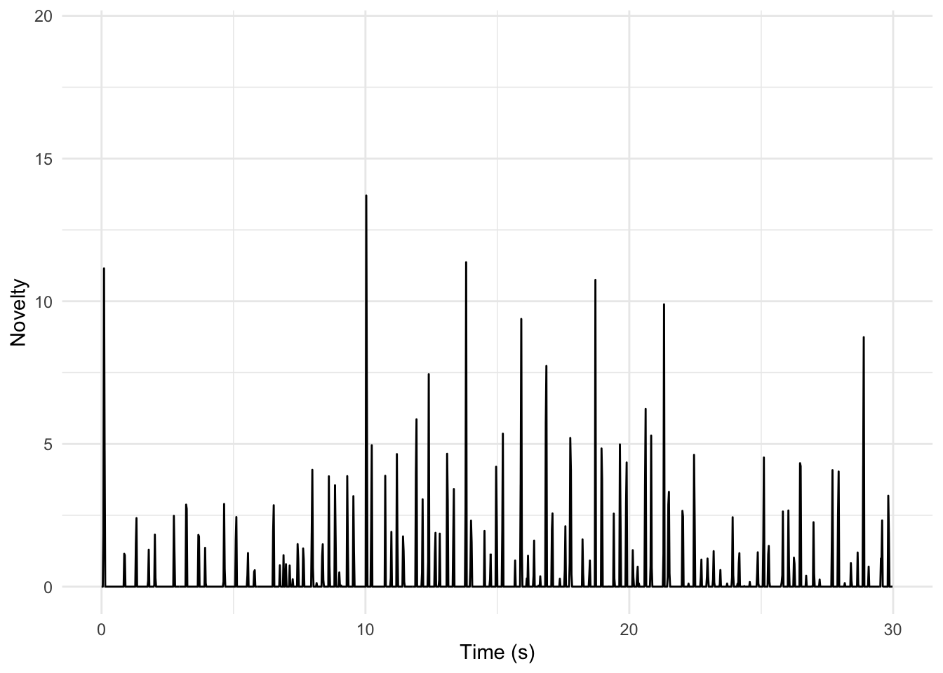
Sonic Visualiser gives easy access to tempo novelty functions. For this course, we will use the option under Transform / Analysis by Category / Visualisation / Tempogram: Novelty Function. You can find the novelty function for Miriam Makeba’s ‘Pata Pata’ in Sonic Visualiser’s CSV format here.
Warning: One or more parsing issues, call `problems()` on your data frame for details,
e.g.:
  dat <- vroom(...)
  problems(dat)
Rows: 7760 Columns: 3
── Column specification ────────────────────────────────────────────────────────
Delimiter: ","
dbl (2): TIME, VALUE
lgl (1): LABEL

ℹ Use `spec()` to retrieve the full column specification for this data.
ℹ Specify the column types or set `show_col_types = FALSE` to quiet this message.
We can compute an energy-based novelty function based on Spotify’s loudness estimates. The tempo of this piece is about 126 BPM: how well does this technique work?
pata_pata |>ggplot(aes(x = TIME, y = VALUE)) +geom_line() +xlim(0, 30) +# Adjust the limits as desiredtheme_minimal() +labs(x ="Time (s)", y ="Novelty")
Warning: Removed 6468 rows containing missing values or values outside the scale range
(`geom_line()`).
Instructions
Listen to the first 30 seconds of ‘Pata Pata’ and discuss the representation above. Does it seem useful?
Choose a track from your corpus and compute your own novelty function. (Change the xlim() line if you want to look at a different portion of your track.) How does it differ from what you see for ‘Pata Pata’? Be prepared to show your best ‘novelty-gram’ to the class.
Breakout 3: Tempograms
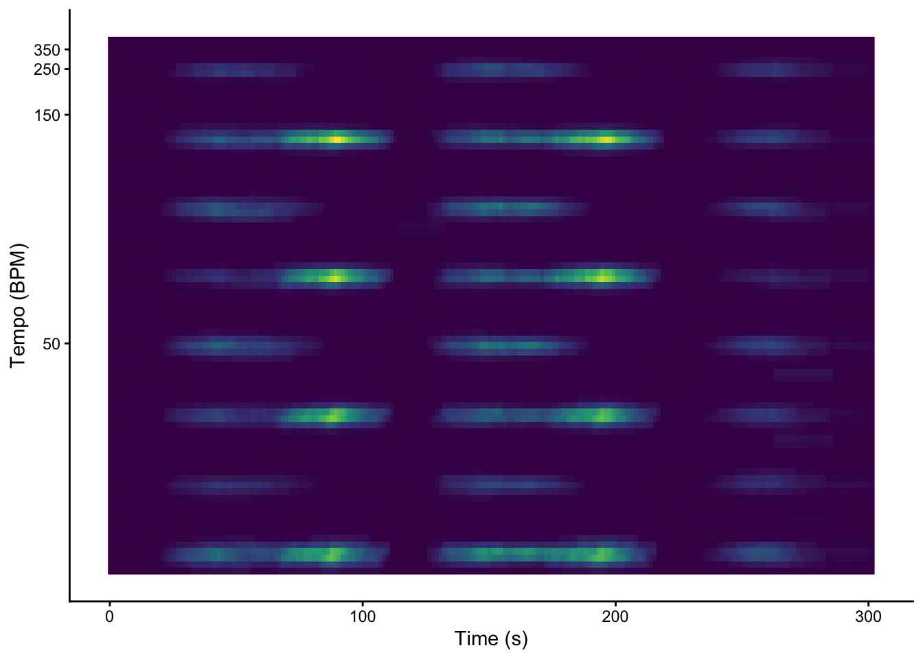
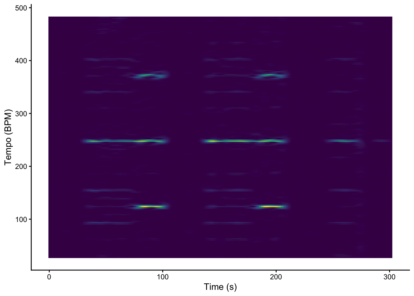
We can use Sonic Visualiser to generate autocorrelation and Fourier, ready to plot with geom_raster (a faster version of geom_tile for when every segment has the same length). The relevant Sonic Visualiser layers are: - Transform / Analysis by Category / Visualisation / Tempogram: Autocorrelation - Transform / Analysis by Category / Visualisation / Tempogram: Fourier Be sure to click both of the options for added columns when exporting.
Rows: 204 Columns: 82
── Column specification ────────────────────────────────────────────────────────
Delimiter: ","
dbl (82): TIME, 30.0463, 30.3998, 30.7617, 31.1323, 31.512, 31.901, 32.2998,...

ℹ Use `spec()` to retrieve the full column specification for this data.
ℹ Specify the column types or set `show_col_types = FALSE` to quiet this message.
Rows: 204 Columns: 182
── Column specification ────────────────────────────────────────────────────────
Delimiter: ","
dbl (182): TIME, 27.7576, 30.2811, 32.8045, 35.3279, 37.8513, 40.3748, 42.89...

ℹ Use `spec()` to retrieve the full column specification for this data.
ℹ Specify the column types or set `show_col_types = FALSE` to quiet this message.
graveola_act |>pivot_longer(-TIME, names_to ="tempo") |>mutate(tempo =as.numeric(tempo)) |>ggplot(aes(x = TIME, y = tempo, fill = value)) +geom_raster() +scale_y_continuous(transform =c("reciprocal", "reverse"), breaks =seq(50, 350, 100)) +scale_fill_viridis_c(guide ="none") +labs(x ="Time (s)", y ="Tempo (BPM)") +theme_classic()
graveola_dft |>pivot_longer(-TIME, names_to ="tempo") |>mutate(tempo =as.numeric(tempo)) |>ggplot(aes(x = TIME, y = tempo, fill = value)) +geom_raster() +scale_fill_viridis_c(guide ="none") +labs(x ="Time (s)", y ="Tempo (BPM)") +theme_classic()
The textbook notes that Fourier-based tempograms tend to pick up strongly on tempo harmonics. Which tempogram seems more effective here?
Instructions
Return to the track you discussed in Breakout 1 (or choose a new track that somebody in your group loves). Compute autocorrelation and Fourier tempograms for this track. - How well do they work? - Do you see more tempo harmonics or more tempo sub-harmonics? Is that what you expected? Why? - Try other tracks as time permits, and be prepared to share your most interesting tempogram with the class.